art day part 2
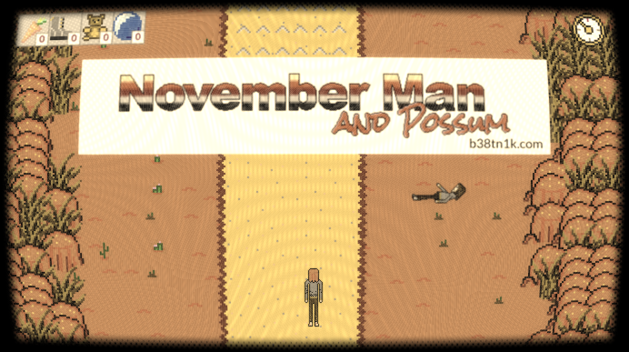
Another art day. The shader work got me motivated to put in some new placeholder and final sprites (as good as I’ll get anyway). Some lanky looking humans and a shiny new logo. Worked on some level logic also, need to build out a bunch more levels quickly, can hopefully lean on existing assets and cut / paste / paint fill :-P
Logo is suitably lofi and cheese.

For narrow screens, I made a stacked text logo. It doesnt look as good but it looks better than scaling the art and getting inconsistent pixel sizes. To that point, I sort of fell into a 2:1 pixel density for landscape vs sprite elements, I think it works ok, maybe makes sense in some sorta aesthetic / early video game thinking - landscape textures cover more area so will fill more memory unless they are simple, sprites as small but should be interesting. IDK, making 32x32 pixels look interesting is a challenge - see Personal Space Invaders.